Saturday 22 February 2014

Back Cover Draft #2


Evaluation - I am really happy with this draft, I think this one looks the most professional yet and fits with the genre very well. I really like the image I have used with its slight blurring and strong light in certain places that was there pre-editing. It also conforms well with the nature aspect of the indie folk genre. The text also looks strong over this image. If I was to change anything then I would maybe try adding some more effects on the image and see what other colours would look good with it.

Making - Back Cover Draft #2

1 - I cropped this section out of another picture that I thought would look good as a cover piece, and set it to the 140mm by 125 mm size.


2 - I then increased the brightness by +57 and the contrast by +32. This made the individual branches stand out more and made the colours more vivid.


3 - I then introduced a purple and orange gradient and changed the opacity to 40% so that it gave an old effect to the image without over powering it.


4 - Next, I added the artist and album name at the top of the image, in the same font and colour used for the front image.


5 - Then, I included the track list horizontally in the bottom third of the image and a divider in between the title and the track list.


6 - I then used the quick selection tool to cut out the compact disc digital audio logo to include on my album cover.


7 - When it was cut out I used the rubber tool to rub out any other unwanted parts that I couldn't get with the quick selection tool. It then looked like this.


8 - I then continued to add conventional elements to the album cover like label logos and a bar code.


9 - Finally, I added the legal information to make the album cover look more professional. I did this in the Times New Roman font, different to the one I used for the artist and album name so that there is a clear distinction between design and formalities.


Thursday 20 February 2014

Back Cover Draft #1


Evaluation - I really like my first draft for the back of my album cover. I think that it looks quite professional and would not look out of place on a CD shelf. I like the use of formalities like the legal information and logos and will continue to use these in my other drafts. I also really like the image I have used as it conforms to the unique arty style that is commonly seen in the indie folk genre. If I was to change anything it would be to make the borders slightly thinner so more emphasis is on the main image.

Making - Back Cover Draft #1

1 - Firstly, I opened a 140 by 125 mm page of photoshop.


2 - I then chose, imported and positioned my chosen image in the correct place. This image was already pre-made from my first album cover draft.


3 - Then, using the shape tool, I made a black border around the image. This is similar to the one on the album cover and will create continuity.


4 - I then added the text at the top of the image.


5 - Next, I added the track list, conventionally on the right hand side.


6 - I then added a barcode to fit with the conventions of the form and to make the product look realistic.


7 - Finally, I added some extra features like legal information and logos to make the product look more realistic and professional.

Poster Draft #3


Evaluation - Overall I am happy with this draft however it is my least favourite of the three. I love the main image and how changing the brightness has really improved it and added to the intended ghostly feel however I aren't as fond of the positioning of the text in this draft and in particular, the banner at the top. Even though it is a good idea, I don't think I executed it in the best way and if I was to re-create this draft, I would spend more time editing and changing its position.

Making - Poster Draft #3

1 - Firstly, I chose the image that would be used as the main body of the poster. I chose this image as it is the same as one of my album cover drafts and would therefore create continuity. I also chose this image as I love the blurred effect created in Lily's body and is used quite frequently within the indie folk genre.


2 - I then increased the contrast by +25 and the brightness by +80. I found this improved the image a great deal as the original image was too dark. The brightening effect also gave the image a more ghostly feel along with the blurred effect.


3 - After that, I added a sepia photo filter to give the image an older more retro feel to it.


4 - I then added another photo filter, this time magenta in order to give the image a slight pink tint and a rosy warm feel.


5 - In order to make the text more visible on the contrasting background, I added a white rectangle shape across the top of the image. I then changed its opacity to soften its appearance and make it less harsh. This made it fit with the image better.


6 - The white shape made it easier to add text over it and make it more visible. The combination of the text and shape makes it more eye catching and stand out better.


7 - I then added the relevant information underneath the title. I like the contrast in colours of the text and background and it makes it subtly different.


8 - Then, using the brush tool I added the star rating at the bottom of the poster where they are most commonly found.


9 - Finally, I added the review quotes on either side of the star rating to keep the poster balanced.

Poster Draft #2


Evaluation - Again, I am very happy with this draft. I particularly like the placement of the writing at the top of the poster and how it stands out from the image behind. I like the mise en scene in this poster as you can see the location better in this draft than the others. The use of nature in the shot like the log Lily is sat on and the running stream behind her all comply with the conventions of the indie folk genre and look professional for a real indie folk album poster. If I was to change anything it would be the gradient. I would reduce it slightly more as I found that it took away a lot of the brightness from the image that would be useful in order to help it stand out better.

Making - Poster Draft #2

1 - Firstly, I chose the image that I would use as the main body of the poster. Because it is already in portrait, I didn't need to select a page size previously.


2 - Next, I used the clone tool to get rid of any unwanted parts of the picture like blemishes or spots. In this case, I used it to remove a section of the camera bag which was accidentally left in the shot. From using this tool I could change the camera bag to look like the log beside it.


3 - I then changed the contrast to +50 and kept the brightness the same. This made the image look edgier and sharper.


4 - The change in contrast the image appear colder in colour so I added a sepia photo filter to warm it up and soften the colours.


5 - I then added the text in the same font and colour as on the album cover as to keep with the continuity and visual recognition of the band.


6 - Underneath the writing I again included a star rating to keep with the conventions of posters.


 7 - As there was now no room left for and more text at the top without compromising the size or font of the existing text, I decided to add a gradient at the bottom of the image so that I could add text at the bottom without the colour of the text becoming invisible due to either the dress or the log. I reduced the opacity of the gradient so that it didn't ruin the image by making it too dark or obvious.


8 - Finally, I added the release date of the album at the bottom of the poster, over the gradient. I made the text large so that it stood out to the audience.

Poster Draft #1


Evaluation - I am really pleased with my first poster draft. In particular, I like how I have used the album cover within the poster as it creates continuity between both ancillary texts making my product more recognisable to an audience. I also like the simplicity of the poster with only a small central main image and text, I think this makes the poster more approachable and easy to read. It also makes the image more eye catching. If I was to change this product, I would possibly make the text a little larger in some areas to fill the space more.

Making - Poster Draft #1

1 - Firstly, I open a blank page on photoshop choosing the 40" by 60" paper. This is the size I will need for a standard poster.


2 - Then using a solid colour, I change the background to black as I feel that black has a more dramatic and eye catching effect on a poster than white does.


3 - I then import my chosen album cover draft, the background being black also helps the album cover image to fit better within the poster. By using my chosen album cover, it creates continuity between my ancillary texts and makes the product more easily recognisable to my audience.


4 - After this, I then add a star rating using the brush tool to conform with the conventions of other music posters. Along with this I add some quoted text as part of the star rating review to give my audience reassurance that what they are buying is trusted.


5 - At the bottom, I then add more text giving information on when the album is released and how to buy it.

Friday 7 February 2014

Ancillary Text - Poster Research

Laura  Marling's simplistic poster is highly conventional of the indie genre. This is done through the use of a clear black and white colour scheme and very little text. The only text used is the artist's name, album title and when the album is released (in this case, now). This makes the viewer more likely to take in the content of the poster as there is less to read, however what text is there stands out very well. The image used is a sketch instead of a photographic image (also used on the album cover). This appeals to an indie audience as they like things that are unconventional of most genres and like to stand out and be individual. The idea that the main image is a piece of art instead of a person pulling a pose that has been seen many times before appeals to the indie audience as new and interesting.


Ben Howard's poster like Laura Marling's includes the same image and text from the album they are promoting. Again, there is little text and what there is stands out, in particular, the artist's name, followed by the album name and then the release dates. Unlike Laura Marling's, this poster also includes instruction to pre-order the album. The image is in water, another convention of the indie folk genre as it symbolises the nature and purity that is reflected in the songs of an indie folk artist. The colour scheme is natural, soft colours. White, black and different shades of blue. The gentle mixture of the colours give a soft tone to the poster that is made to resemble the tone of the music it is promoting.

Noah And The Whale's poster, again like the others, is made up of the same image and text that is used in the album cover, this creates continuity and visual recognisation for the audience so that it is easier for them to understand what the poster is promoting. Unlike the other posters, there is quite a lot more text. For example, there are reviews at the top of the poster. This gives the audience reassurance that what they are buying is good quality. It also has information on how they can buy the CD or download or to even get a deluxe CD and DVD combo. The colour scheme is Black, light blues and White. The use of soft, neutral colours reflect the genre and mood of the music. The use of the old fashioned camera in the main image is self-reflexive as it shows the media text. This is conventional of the genre as 'indie' music rebels against the 'norm' of the music industry.

Wednesday 5 February 2014

Album Cover Draft # 3


Evaluation:
My final draft for my album cover is my favourite so far. I am pleased that I used the original design from my first draft but I think this image is a lot clearer and looks more professional. I think this draft also shows more skill as it took more time in photoshop to create it. If I was going to re-create this draft I would maybe edit the text further to make it stand out more, however at the same time, I do rather like it's subtlety. I have taken a lot of inspiration from Warpaint's album and also the 'Daughter - if you leave' album. In particular, the design/layout and the idea of super imposing the faces from Warpaint, and the use of location and natual woodlands from the Daughter album.

 - Inspiration

Making - Album Cover Draft # 3

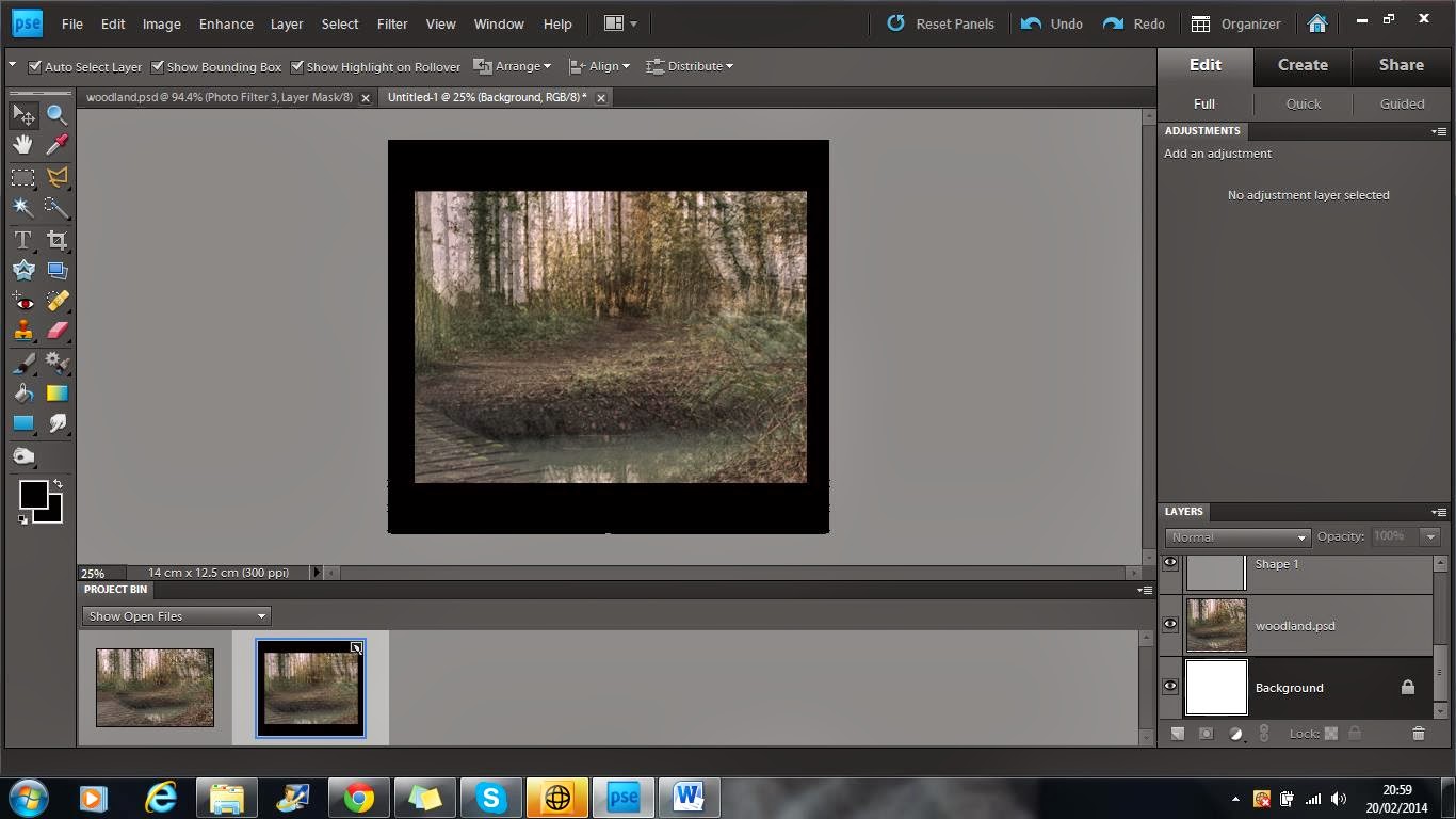
1 - Firstly, I placed the chosen image for my background in photoshop. I decided to use an image of the location from filming as the background to create familiarity between the album cover and the single. The picture of a woodland is also conventional for the indie folk genre as it promotes nature and simplicity.


2 - I then duplicated the image three times and placed them over each other to give the image a blurry, ghostly feel.


 3 - Next I added a red photo filter to add more colour to the mainly green image. The mixture of the colours takes the harshness away from the image.


4 - After this I added another filter, this time an orange one. This gave a warming effect to the image, brightening it up and again reducing the harshness of the green.


5 - Lastly for this section, I placed a blue filter on top of the others. This allowed the image to still have a warm feeling but the blue just toned it down slightly giving it a better balance.


6 - This was the final background image.


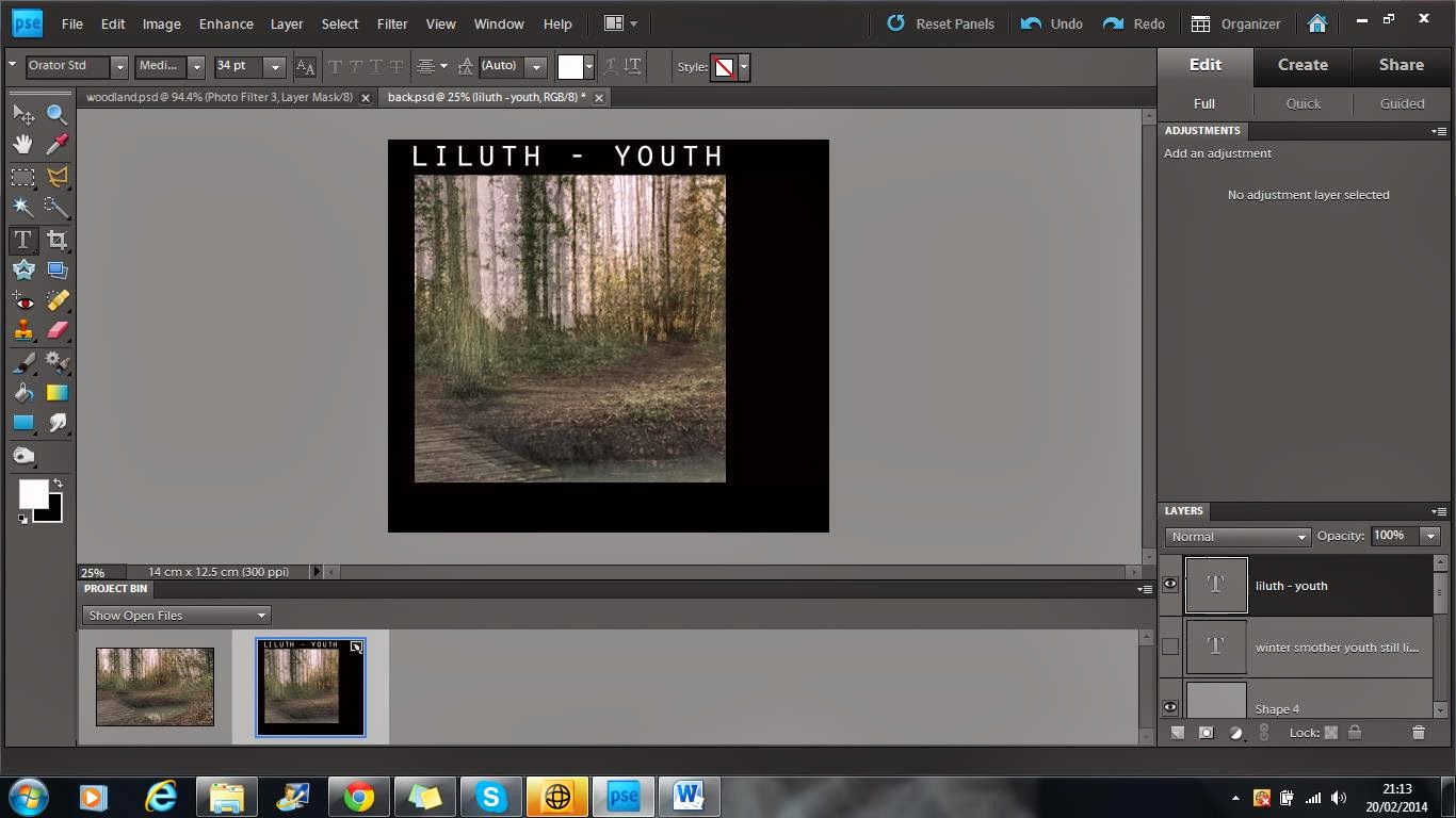
7 - On another page, I started to edit the images I would place on top of my background.


8 - After duplicating my image, I used the quick selection tool to get rid of the background efficiently. Unlike the eraser tool, quick selection allowed me to cut out sections very quickly.


                          9 - Once the subject was fully cut out, it looked like                             this.


10 - The eraser tool then became very helpful in cutting out small sections that the quick selection tool missed.


11 - When the subject was fully cut out to a good standard I placed it on top of the background image and changed the opacity to 73% to add to the ghostly effect of the background.


12 - I then used the smudge tool to go over the outline of the subject, this reduced the harshness greatly and made the image look more in place. I then super imposed three more different angles of Lily's face and placed them on top of each other in slightly different positions and repeated the six previous steps.


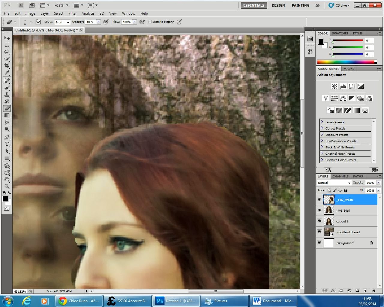
13 - The eraser tool was used again to get rid of any background that has not picked up by the quick selection tool and also allowed me to get rid of any wisps of hair that I didn't want in the image.


14 - On the last face angle the smudge tool became very helpful in decreasing the harshness in the outline of Lily. It also allowed me to make the image look a lot more 3-D and make the flow of her hair appear longer.


15 - After changing the opacity of the final face angle, this was the finished image.


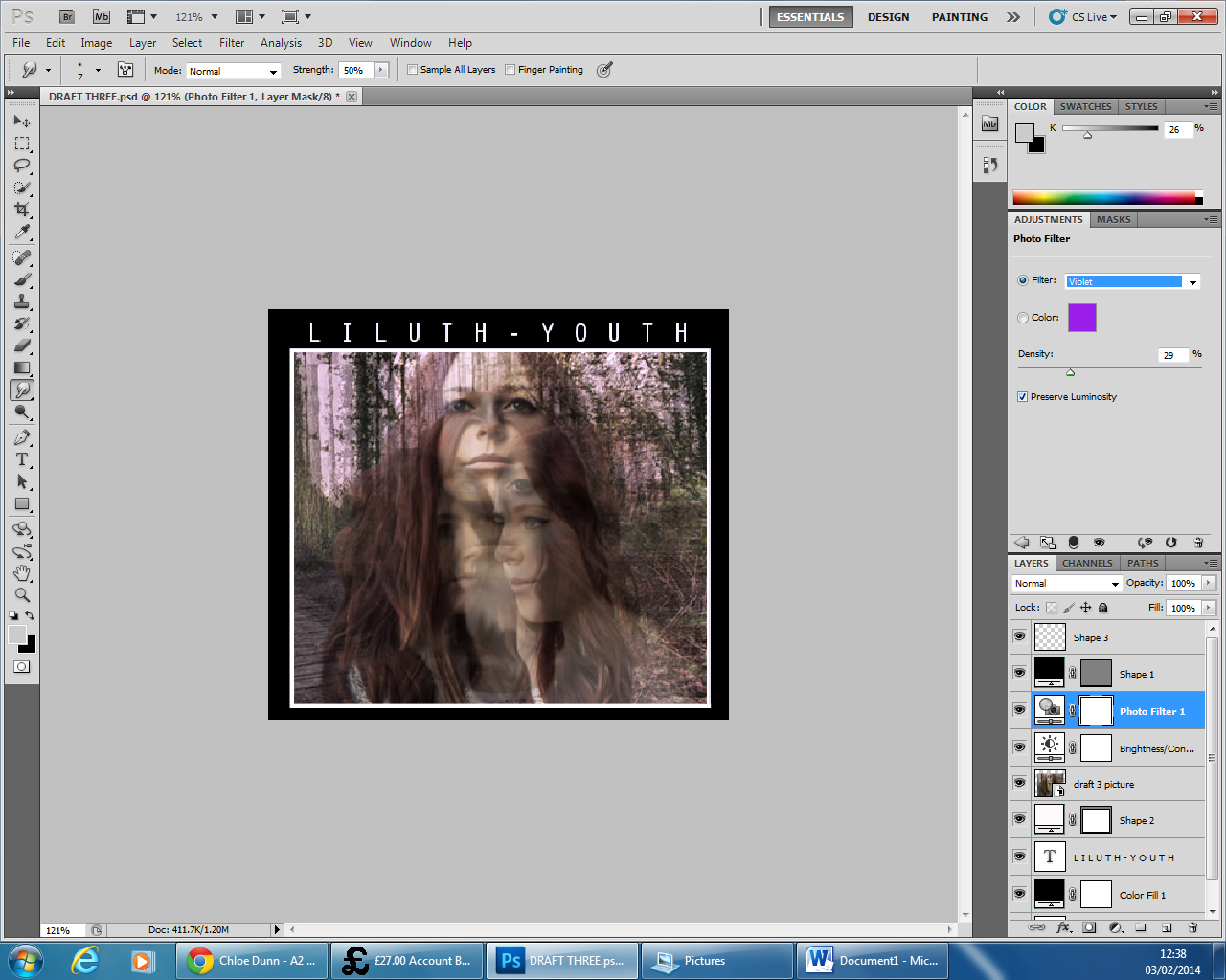
16 - As you can see in the previous image, there are lines at the bottom of the image from the cut outs, to cover this up I added a black border around the sides. I chose to do this over using the smudge tool because I liked this design from my first draft.


17 - Keeping with the design from my first draft, I added a smaller white outline to the image to make it stand out more and then used the Orator STD font to make my text. I placed the text centre and added an extra space between each character to space out the text and make it more visible. I then proceeded to increase the brightness by 7 and the contrast by 41. This brought more definition to the image and made each face stand out whilst still keeping the ghostly effect.


18 - I then added a violet photo filter to contrast nicely with the neutral greens and browns in the original image.


19 - After this, I continued to add another photo filter, this time an orange one warm up the image whilst still keeping a nice balance of neutral and brighter colours.


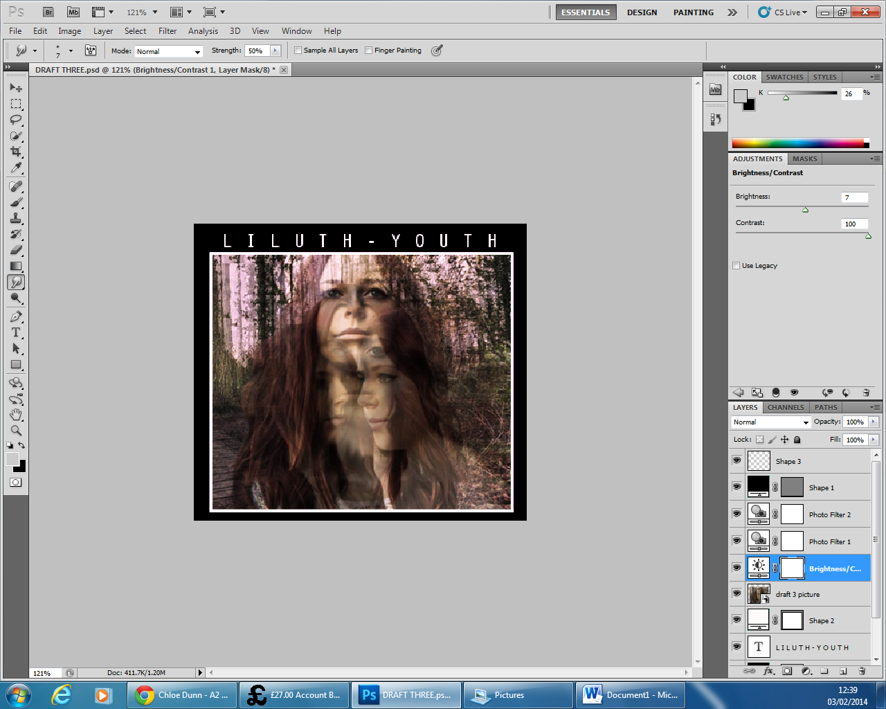
20 - I then further increased the contrast to 100% as I wanted to give the maximum amount of definition to the faces. It also made the colours stand out a lot more and I believe grab the viewers better.


21 - Lastly, I added another photo filter, this time a very light blue. I found this highlighted the white in Lily's face really well and seemed to make her project out of the cover more.