1 - Bus Stop
2 - Bus Advertisement
3 - itunes
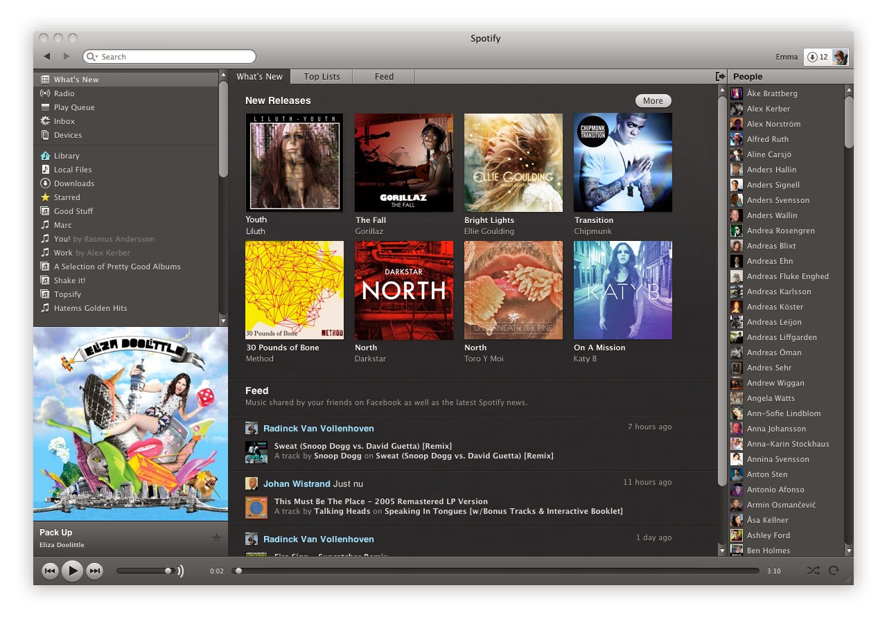
4 - Spotify
5 - Vevo
6 - Facebook
7 - Magazine spread
Friday, 21 March 2014
Wednesday, 19 March 2014
Monday, 17 March 2014
Side image drafts - Before and after Photoshop
Friday, 14 March 2014
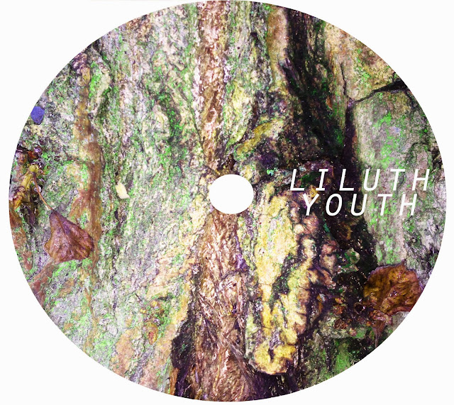
Disc Draft #3
Evaluation - Out of all my drafts, this one is my least favourite. I think the image is conventional of the genre due to the colours and the blurred effect and the blurriness makes the text stand out well, however it is quite boring and nothing about it stands out to an audience. Therefore if I was to do this draft again, I would pick an image that stands out more.
Disc Draft #2
Evaluation - I really love the brightness of both images in this draft and the clarity of the trees. I think it displays a good understanding of the conventions of trees in my genre and relates to 'youth' itself. I also really like the placement of the text in this draft as it is well balanced and aesthetically pleasing. If I was to change anything about this draft it would be the image. Even though I really like the image I think it looks a bit too clear and I feel that the image takes attention away from the text which is the main thing that needs to be promoted. Apart from this, I like the draft a lot.
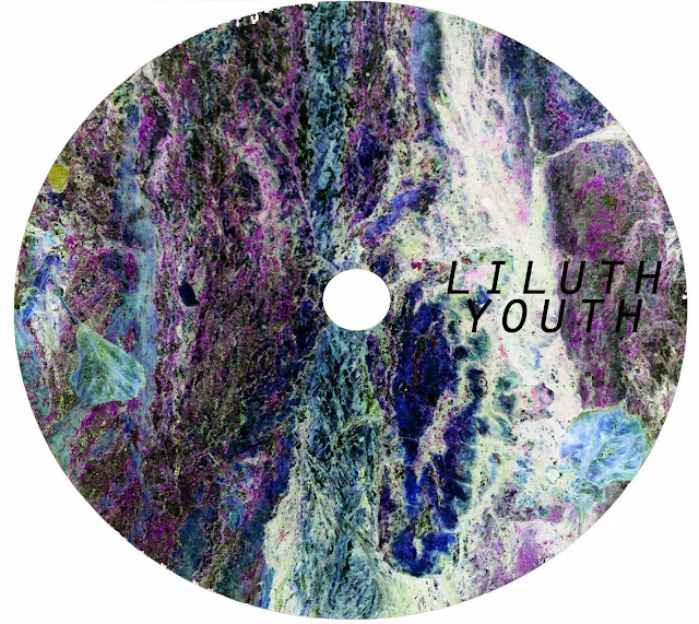
Disc Draft #1


Evaluation - I really like this draft, I think the colours stand out really well without taking too much attention away from the text. The inverted version looks very arty which would appeal to my target audience. The only thing I would change about this draft is the placement of the text, I don't think it looks very balanced here so I would maybe place the text across the middle on both sides. Overall, I am very pleased with this draft.
Thursday, 13 March 2014
Making a Disc
1 - Firstly, I opened a new page in Photoshop with the measurements 140mm by 125mm, to keep it the same size as the other pages of the digipak.
2- You are then left with this. I then copied the image I wanted over the top of the page.
3 - I then zoomed in to the image and chose the correct placement .
4 - Now, using the shape tool, I drew a circle and placed it directly central in the page, making sure that there was space around the edge.
5 - Then, making sure you are selected on the image layer, you can use the magic wand tool to quickly select the image around the circle to delete.
6 - In some cases, the magic wand tool cannot be used, like for instance in this photo where there are so many contrasting colours that it doesn't know what to select. Therefore, I used the polygon lasso tool. Though more time consuming, it works just as well. You continue to cut out until all the colour has gone from the screen.
7 - Then, when you turn the circle layer off, you are left with a perfect circle of your image, resembling a disk.
8 - Then using the layer options, you can adjust the image to change the brightness and contrast and colouring. In my disks, I tended to use Hue and Saturation and Levels the most.
9 - Using the shape tool again, I made a smaller circle and placed it central to show the hole in the middle of the disk.
Friday, 7 March 2014
Subscribe to:
Comments (Atom)


