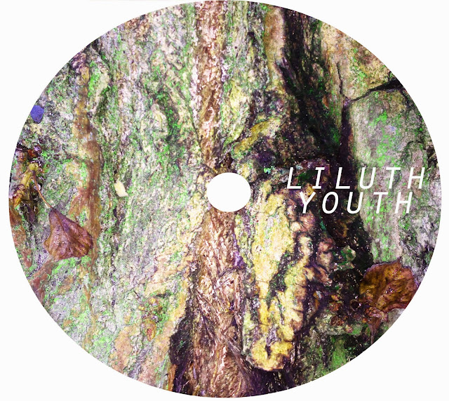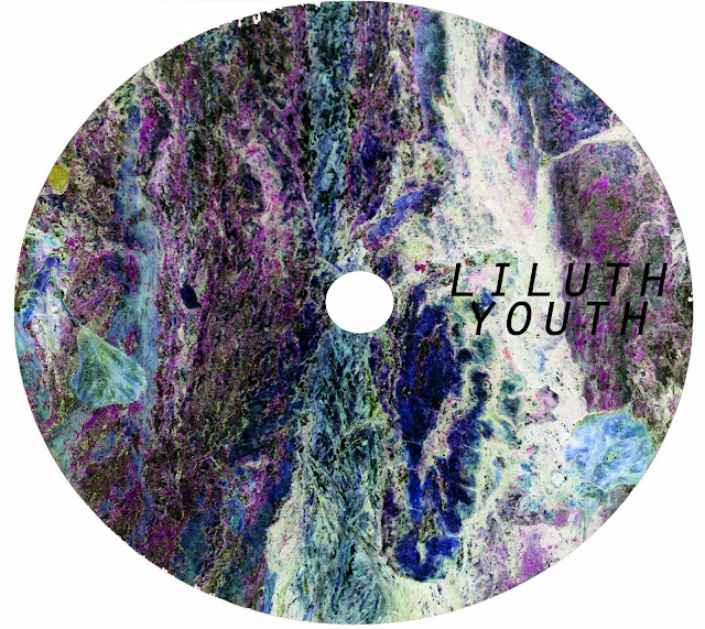

Evaluation - I really like this draft, I think the colours stand out really well without taking too much attention away from the text. The inverted version looks very arty which would appeal to my target audience. The only thing I would change about this draft is the placement of the text, I don't think it looks very balanced here so I would maybe place the text across the middle on both sides. Overall, I am very pleased with this draft.
No comments:
Post a Comment