Wednesday, 5 February 2014
Album Cover Draft # 3
Evaluation:
My final draft for my album cover is my favourite so far. I am pleased that I used the original design from my first draft but I think this image is a lot clearer and looks more professional. I think this draft also shows more skill as it took more time in photoshop to create it. If I was going to re-create this draft I would maybe edit the text further to make it stand out more, however at the same time, I do rather like it's subtlety. I have taken a lot of inspiration from Warpaint's album and also the 'Daughter - if you leave' album. In particular, the design/layout and the idea of super imposing the faces from Warpaint, and the use of location and natual woodlands from the Daughter album.
- Inspiration
Making - Album Cover Draft # 3
1 - Firstly, I placed the chosen image for my background in photoshop. I decided to use an image of the location from filming as the background to create familiarity between the album cover and the single. The picture of a woodland is also conventional for the indie folk genre as it promotes nature and simplicity.
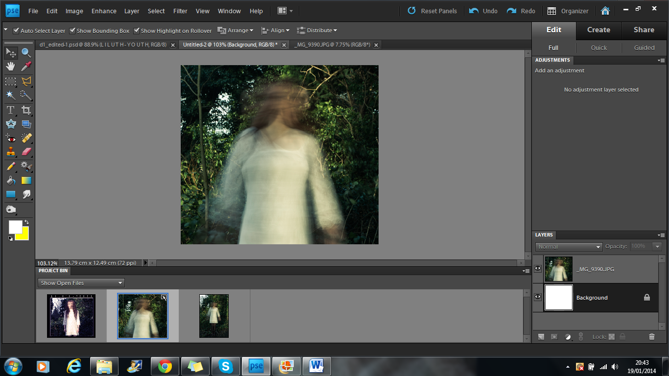
2 - I then duplicated the image three times and placed them over each other to give the image a blurry, ghostly feel.
3 - Next I added a red photo filter to add more colour to the mainly green image. The mixture of the colours takes the harshness away from the image.
4 - After this I added another filter, this time an orange one. This gave a warming effect to the image, brightening it up and again reducing the harshness of the green.
5 - Lastly for this section, I placed a blue filter on top of the others. This allowed the image to still have a warm feeling but the blue just toned it down slightly giving it a better balance.
6 - This was the final background image.
7 - On another page, I started to edit the images I would place on top of my background.
8 - After duplicating my image, I used the quick selection tool to get rid of the background efficiently. Unlike the eraser tool, quick selection allowed me to cut out sections very quickly.
9 - Once the subject was fully cut out, it looked like this.
10 - The eraser tool then became very helpful in cutting out small sections that the quick selection tool missed.
11 - When the subject was fully cut out to a good standard I placed it on top of the background image and changed the opacity to 73% to add to the ghostly effect of the background.
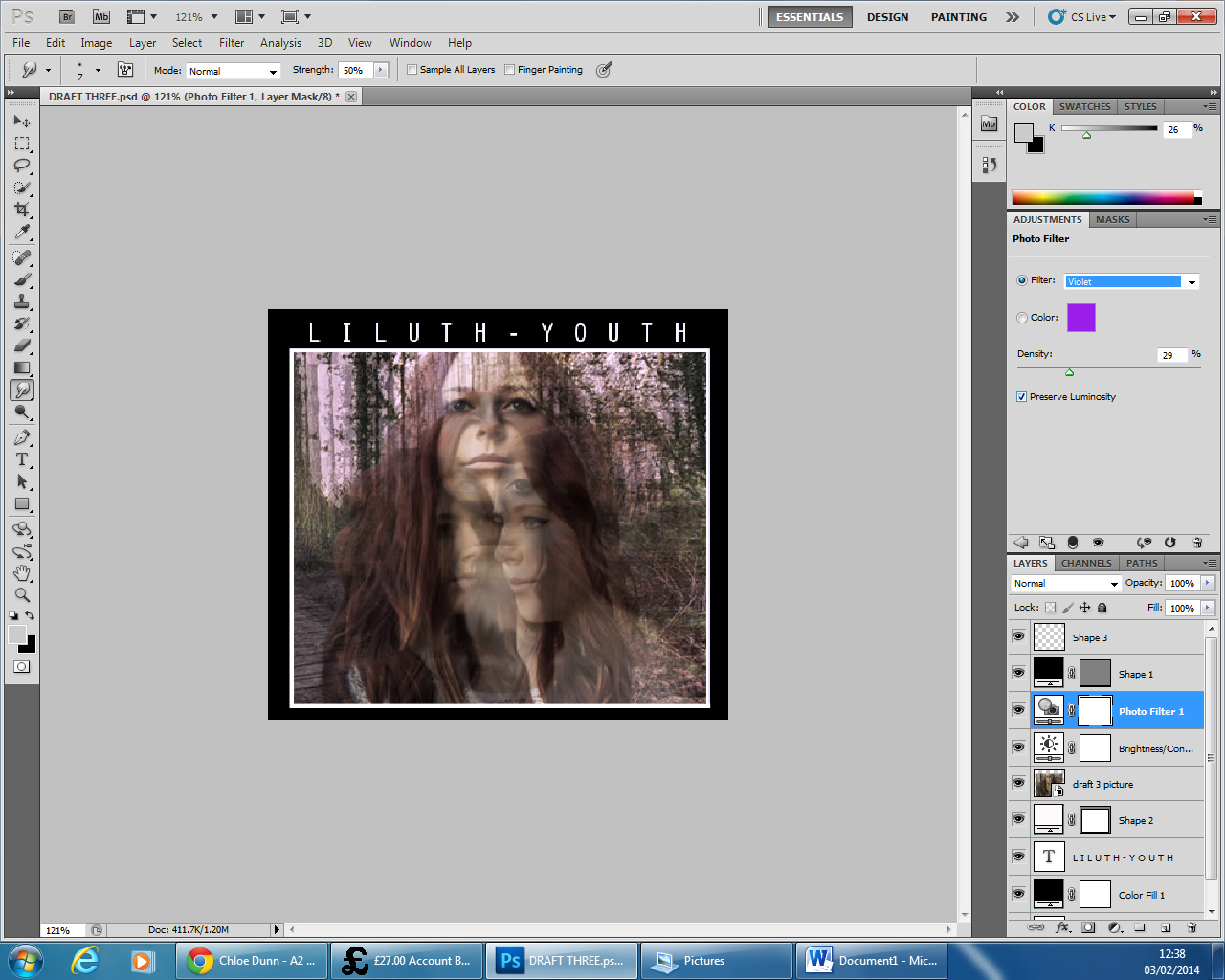
12 - I then used the smudge tool to go over the outline of the subject, this reduced the harshness greatly and made the image look more in place. I then super imposed three more different angles of Lily's face and placed them on top of each other in slightly different positions and repeated the six previous steps.
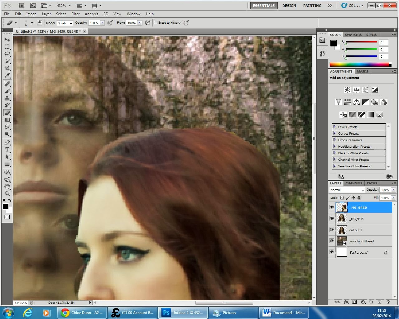
13 - The eraser tool was used again to get rid of any background that has not picked up by the quick selection tool and also allowed me to get rid of any wisps of hair that I didn't want in the image.
14 - On the last face angle the smudge tool became very helpful in decreasing the harshness in the outline of Lily. It also allowed me to make the image look a lot more 3-D and make the flow of her hair appear longer.
15 - After changing the opacity of the final face angle, this was the finished image.
16 - As you can see in the previous image, there are lines at the bottom of the image from the cut outs, to cover this up I added a black border around the sides. I chose to do this over using the smudge tool because I liked this design from my first draft.
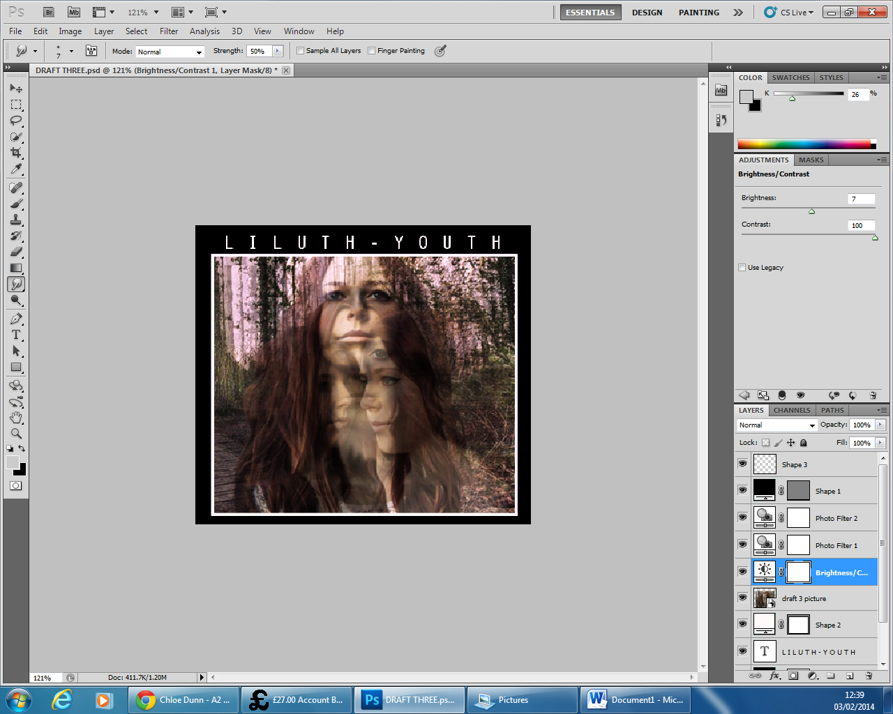
17 - Keeping with the design from my first draft, I added a smaller white outline to the image to make it stand out more and then used the Orator STD font to make my text. I placed the text centre and added an extra space between each character to space out the text and make it more visible. I then proceeded to increase the brightness by 7 and the contrast by 41. This brought more definition to the image and made each face stand out whilst still keeping the ghostly effect.
18 - I then added a violet photo filter to contrast nicely with the neutral greens and browns in the original image.
19 - After this, I continued to add another photo filter, this time an orange one warm up the image whilst still keeping a nice balance of neutral and brighter colours.
20 - I then further increased the contrast to 100% as I wanted to give the maximum amount of definition to the faces. It also made the colours stand out a lot more and I believe grab the viewers better.
21 - Lastly, I added another photo filter, this time a very light blue. I found this highlighted the white in Lily's face really well and seemed to make her project out of the cover more.
2 - I then duplicated the image three times and placed them over each other to give the image a blurry, ghostly feel.
3 - Next I added a red photo filter to add more colour to the mainly green image. The mixture of the colours takes the harshness away from the image.
4 - After this I added another filter, this time an orange one. This gave a warming effect to the image, brightening it up and again reducing the harshness of the green.
5 - Lastly for this section, I placed a blue filter on top of the others. This allowed the image to still have a warm feeling but the blue just toned it down slightly giving it a better balance.
6 - This was the final background image.
7 - On another page, I started to edit the images I would place on top of my background.
8 - After duplicating my image, I used the quick selection tool to get rid of the background efficiently. Unlike the eraser tool, quick selection allowed me to cut out sections very quickly.
9 - Once the subject was fully cut out, it looked like this.
10 - The eraser tool then became very helpful in cutting out small sections that the quick selection tool missed.
11 - When the subject was fully cut out to a good standard I placed it on top of the background image and changed the opacity to 73% to add to the ghostly effect of the background.
12 - I then used the smudge tool to go over the outline of the subject, this reduced the harshness greatly and made the image look more in place. I then super imposed three more different angles of Lily's face and placed them on top of each other in slightly different positions and repeated the six previous steps.
13 - The eraser tool was used again to get rid of any background that has not picked up by the quick selection tool and also allowed me to get rid of any wisps of hair that I didn't want in the image.14 - On the last face angle the smudge tool became very helpful in decreasing the harshness in the outline of Lily. It also allowed me to make the image look a lot more 3-D and make the flow of her hair appear longer.
15 - After changing the opacity of the final face angle, this was the finished image.
16 - As you can see in the previous image, there are lines at the bottom of the image from the cut outs, to cover this up I added a black border around the sides. I chose to do this over using the smudge tool because I liked this design from my first draft.
17 - Keeping with the design from my first draft, I added a smaller white outline to the image to make it stand out more and then used the Orator STD font to make my text. I placed the text centre and added an extra space between each character to space out the text and make it more visible. I then proceeded to increase the brightness by 7 and the contrast by 41. This brought more definition to the image and made each face stand out whilst still keeping the ghostly effect.
18 - I then added a violet photo filter to contrast nicely with the neutral greens and browns in the original image.
19 - After this, I continued to add another photo filter, this time an orange one warm up the image whilst still keeping a nice balance of neutral and brighter colours.
20 - I then further increased the contrast to 100% as I wanted to give the maximum amount of definition to the faces. It also made the colours stand out a lot more and I believe grab the viewers better.
21 - Lastly, I added another photo filter, this time a very light blue. I found this highlighted the white in Lily's face really well and seemed to make her project out of the cover more.
Sunday, 2 February 2014
Album Cover Draft # 2
Evaluation:
I am happy with my second draft of my album cover. I like the mixture of colours like the purples and the blues contrasted with the natural greens and whites of the background. I took inspiration from the original artists' album 'Daughter - If you leave' as the image is blurred and the face not seen. I think this makes my album cover have a good idea of the artists' intended feel for her album without directly copying it. I really like the use of colours in the title; the baby blues and pinks as it connotes being young and innocent and also being happy which contrasts the actual analysis of the song's lyrics. If I was to change anything about this draft it would be to make the text bigger so that it stands out more.
Inspiration.
Making - Album Cover Draft # 2
1 - To start with, I had to make my image fit the 140mm by 125mm measurements. Ideally, I would have liked to use the whole image as the full body would look good in the shot, however this wasn't possible to do while keeping the natural shape of the image. I chose to use the upper half of her body as the main focus of the image as the blurred effect looked a lot better.
2 - I then changed the levels of the image, picking out the deeper purple colours as it had a similar effect to the blue in my first draft, however the purple is slightly warmer and less depressing.
3 - After that, I altered the brightness and contrast. I increased the brightness by 54 and the contrast by 21. This made the image look more three dimensional and helped it stand out a lot better. It also brought out the purple tones a lot more.
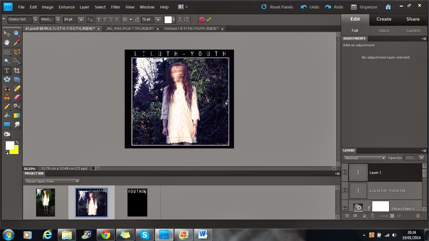
4 - When I was satisfied with the editing to the image, I then moved on to the text. I used the font Orator STD like in my last draft and placed it at the bottom of the image. The text was 24pt and in lilac.
5 - I wasn't totally happy with the text then so I copied and pasted the exact copy of the original text but changed the colour to a rose pink and placed it over the original text but slightly off so that you could still see the original text too.
6 - I then repeated the last step but with a lighter pink.
7 - Finally, I repeated the last step again but with a baby blue. The mixture of colours made the text stand out a lot better than the original idea of just having one layer of text. It also added an individual idea to the image.
2 - I then changed the levels of the image, picking out the deeper purple colours as it had a similar effect to the blue in my first draft, however the purple is slightly warmer and less depressing.
3 - After that, I altered the brightness and contrast. I increased the brightness by 54 and the contrast by 21. This made the image look more three dimensional and helped it stand out a lot better. It also brought out the purple tones a lot more.
4 - When I was satisfied with the editing to the image, I then moved on to the text. I used the font Orator STD like in my last draft and placed it at the bottom of the image. The text was 24pt and in lilac.
5 - I wasn't totally happy with the text then so I copied and pasted the exact copy of the original text but changed the colour to a rose pink and placed it over the original text but slightly off so that you could still see the original text too.
6 - I then repeated the last step but with a lighter pink.
7 - Finally, I repeated the last step again but with a baby blue. The mixture of colours made the text stand out a lot better than the original idea of just having one layer of text. It also added an individual idea to the image.
Saturday, 1 February 2014
Album Cover Draft # 1
Evaluation:
I really like my first draft of my album cover. I think the text, image and colour scheme used really conform with the conventions of indie folk making my product have more verisimilitude as well as looking more professional. I took inspiration from the border/outline from Warpaint's album as it makes the image stand out better and also makes the text easier to see. If I was to remake this draft again, the only change I would make would be to photoshop out her bracelets using the clone tool.
Inspiration.
Making - Album Cover Draft # 1
1 - The first step in photoshop was to create the right size background (which is 140mm by 125mm) I chose to have a black background since the text I am using is white. This will ensure my texts stands out from the rest of the image.
2 - I then cropped the picture I wanted to the correct size and added it to the background. I decided to keep the black border around the sides of the image as it makes the image stand out more.
3 - To make the image stand out even more, I introduced a white box layer slightly bigger than the image, and placed it behind the image. This made it look like there was a white outline. This step took a while to do as I struggled to get the correct thickness and make it even. Eventually I got it right and I think it looks better and more professional.
4 - I then altered the image by manipulating the levels, focusing it more on the blue tones in the image, reflecting the mood and tones of the song.
5 - I then changed the brightness and contrast by brightening the image by 13 and reducing the contrast by -8, this overall made the image considerably brighter and gave a lighter feel to the tone of the image.
6 - I increased the hue by +5, again pulling out the blue tones in the image adding to the melancholic mood of the song.
7 - I then added a sepia photo filter to make the image slightly warmer. the mixture of the blues from the hue and levels and the oranges in the sepia filter gave the image a retro, worn feel that is conventionally used in the indie genre.

8 - Finally, I added the text to the image. I used the Orator STD font and placed it top central so it can be clearly seen. I decided to put a space between each letter as increased the size of the text without having to make it bold or take away the sophisticated thinness of the text.
2 - I then cropped the picture I wanted to the correct size and added it to the background. I decided to keep the black border around the sides of the image as it makes the image stand out more.
3 - To make the image stand out even more, I introduced a white box layer slightly bigger than the image, and placed it behind the image. This made it look like there was a white outline. This step took a while to do as I struggled to get the correct thickness and make it even. Eventually I got it right and I think it looks better and more professional.
4 - I then altered the image by manipulating the levels, focusing it more on the blue tones in the image, reflecting the mood and tones of the song.
5 - I then changed the brightness and contrast by brightening the image by 13 and reducing the contrast by -8, this overall made the image considerably brighter and gave a lighter feel to the tone of the image.
6 - I increased the hue by +5, again pulling out the blue tones in the image adding to the melancholic mood of the song.
7 - I then added a sepia photo filter to make the image slightly warmer. the mixture of the blues from the hue and levels and the oranges in the sepia filter gave the image a retro, worn feel that is conventionally used in the indie genre.

8 - Finally, I added the text to the image. I used the Orator STD font and placed it top central so it can be clearly seen. I decided to put a space between each letter as increased the size of the text without having to make it bold or take away the sophisticated thinness of the text.
Text Examples
From research, I can see that the majority of text used on album covers in the indie folk genre are in either black or white. This reflects the simplicity of the genre whilst also standing out from the image. The fonts seem to either be in a very simple font or one that resembles handwriting. The fonts are generally thin with no use of italics or bold. This again reflects the simplicity of the genre by showing that they don't need large colourful text to advertise their album. They rely more on the content of the album than it's aesthetics.
My drafts are as follows:

Century Gothic
Comic Sans

MV Boli
Orator STD
Segoe Script
Tempus Sans ITC
Vrinda
I have used a range of fonts and styles, some all in capitals and some not and some are simple fonts and others resemble hand writing. All the text is in white as I think it reflects the protagonist idea that themes in my video with the repetition of white to resemble purity and innocence; two things that aren't stereotypical of the youth today, however this works well as the indie genre are always trying to break boundaries and ideologies. The font I have decided to use is Orator STD as I think this looks the most like the other texts I have researched, making my product have more verisimilitude. It is very slim line and sophisticated which is the look I am going trying to re-create in my album cover.
Subscribe to:
Posts (Atom)