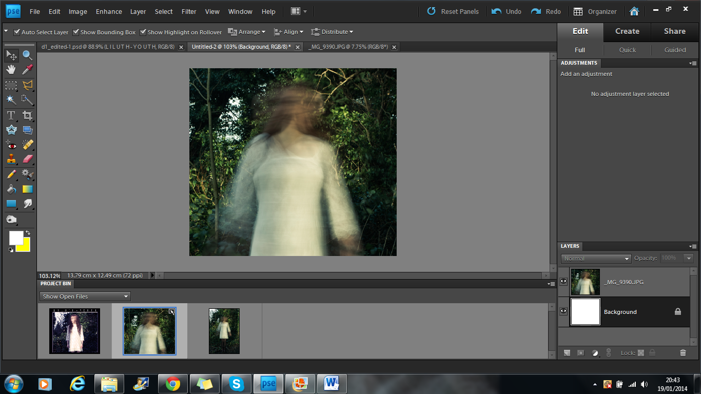
1 - To start with, I had to make my image fit the 140mm by 125mm measurements. Ideally, I would have liked to use the whole image as the full body would look good in the shot, however this wasn't possible to do while keeping the natural shape of the image. I chose to use the upper half of her body as the main focus of the image as the blurred effect looked a lot better.
2 - I then changed the levels of the image, picking out the deeper purple colours as it had a similar effect to the blue in my first draft, however the purple is slightly warmer and less depressing.
3 - After that, I altered the brightness and contrast. I increased the brightness by 54 and the contrast by 21. This made the image look more three dimensional and helped it stand out a lot better. It also brought out the purple tones a lot more.
4 - When I was satisfied with the editing to the image, I then moved on to the text. I used the font Orator STD like in my last draft and placed it at the bottom of the image. The text was 24pt and in lilac.
5 - I wasn't totally happy with the text then so I copied and pasted the exact copy of the original text but changed the colour to a rose pink and placed it over the original text but slightly off so that you could still see the original text too.
6 - I then repeated the last step but with a lighter pink.
7 - Finally, I repeated the last step again but with a baby blue. The mixture of colours made the text stand out a lot better than the original idea of just having one layer of text. It also added an individual idea to the image.


No comments:
Post a Comment