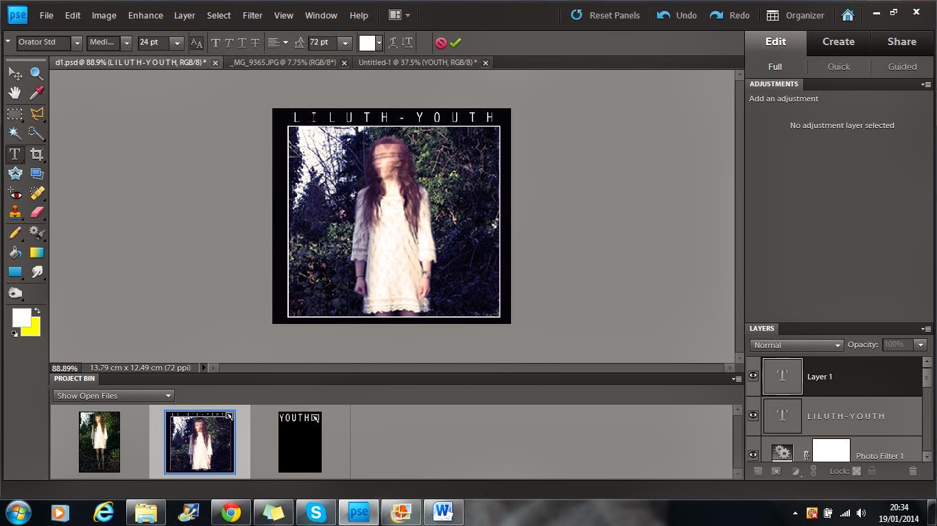
2 - I then cropped the picture I wanted to the correct size and added it to the background. I decided to keep the black border around the sides of the image as it makes the image stand out more.
3 - To make the image stand out even more, I introduced a white box layer slightly bigger than the image, and placed it behind the image. This made it look like there was a white outline. This step took a while to do as I struggled to get the correct thickness and make it even. Eventually I got it right and I think it looks better and more professional.
4 - I then altered the image by manipulating the levels, focusing it more on the blue tones in the image, reflecting the mood and tones of the song.
5 - I then changed the brightness and contrast by brightening the image by 13 and reducing the contrast by -8, this overall made the image considerably brighter and gave a lighter feel to the tone of the image.
6 - I increased the hue by +5, again pulling out the blue tones in the image adding to the melancholic mood of the song.
7 - I then added a sepia photo filter to make the image slightly warmer. the mixture of the blues from the hue and levels and the oranges in the sepia filter gave the image a retro, worn feel that is conventionally used in the indie genre.

8 - Finally, I added the text to the image. I used the Orator STD font and placed it top central so it can be clearly seen. I decided to put a space between each letter as increased the size of the text without having to make it bold or take away the sophisticated thinness of the text.


No comments:
Post a Comment