2 - I then duplicated the image three times and placed them over each other to give the image a blurry, ghostly feel.
3 - Next I added a red photo filter to add more colour to the mainly green image. The mixture of the colours takes the harshness away from the image.
4 - After this I added another filter, this time an orange one. This gave a warming effect to the image, brightening it up and again reducing the harshness of the green.
5 - Lastly for this section, I placed a blue filter on top of the others. This allowed the image to still have a warm feeling but the blue just toned it down slightly giving it a better balance.
6 - This was the final background image.
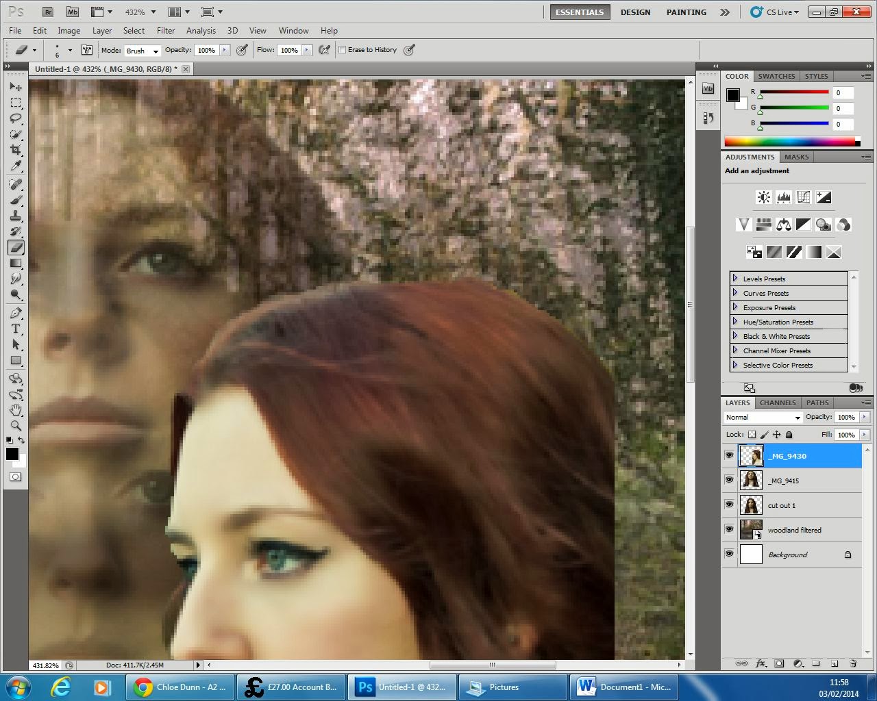
7 - On another page, I started to edit the images I would place on top of my background.
8 - After duplicating my image, I used the quick selection tool to get rid of the background efficiently. Unlike the eraser tool, quick selection allowed me to cut out sections very quickly.
9 - Once the subject was fully cut out, it looked like this.
10 - The eraser tool then became very helpful in cutting out small sections that the quick selection tool missed.
11 - When the subject was fully cut out to a good standard I placed it on top of the background image and changed the opacity to 73% to add to the ghostly effect of the background.
12 - I then used the smudge tool to go over the outline of the subject, this reduced the harshness greatly and made the image look more in place. I then super imposed three more different angles of Lily's face and placed them on top of each other in slightly different positions and repeated the six previous steps.
 13 - The eraser tool was used again to get rid of any background that has not picked up by the quick selection tool and also allowed me to get rid of any wisps of hair that I didn't want in the image.
14 - On the last face angle the smudge tool became very helpful in decreasing the harshness in the outline of Lily. It also allowed me to make the image look a lot more 3-D and make the flow of her hair appear longer.
15 - After changing the opacity of the final face angle, this was the finished image.
16 - As you can see in the previous image, there are lines at the bottom of the image from the cut outs, to cover this up I added a black border around the sides. I chose to do this over using the smudge tool because I liked this design from my first draft.
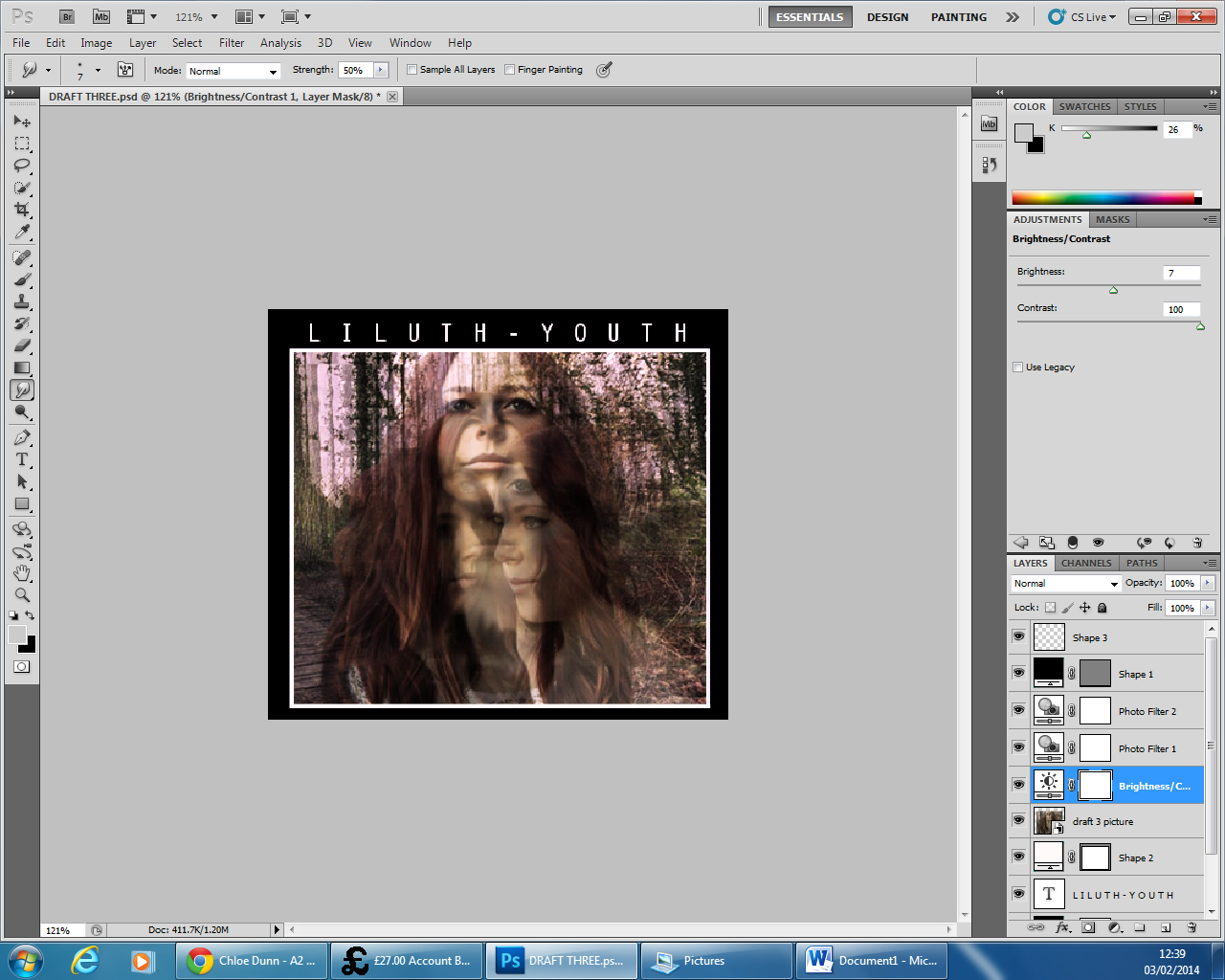
17 - Keeping with the design from my first draft, I added a smaller white outline to the image to make it stand out more and then used the Orator STD font to make my text. I placed the text centre and added an extra space between each character to space out the text and make it more visible. I then proceeded to increase the brightness by 7 and the contrast by 41. This brought more definition to the image and made each face stand out whilst still keeping the ghostly effect.
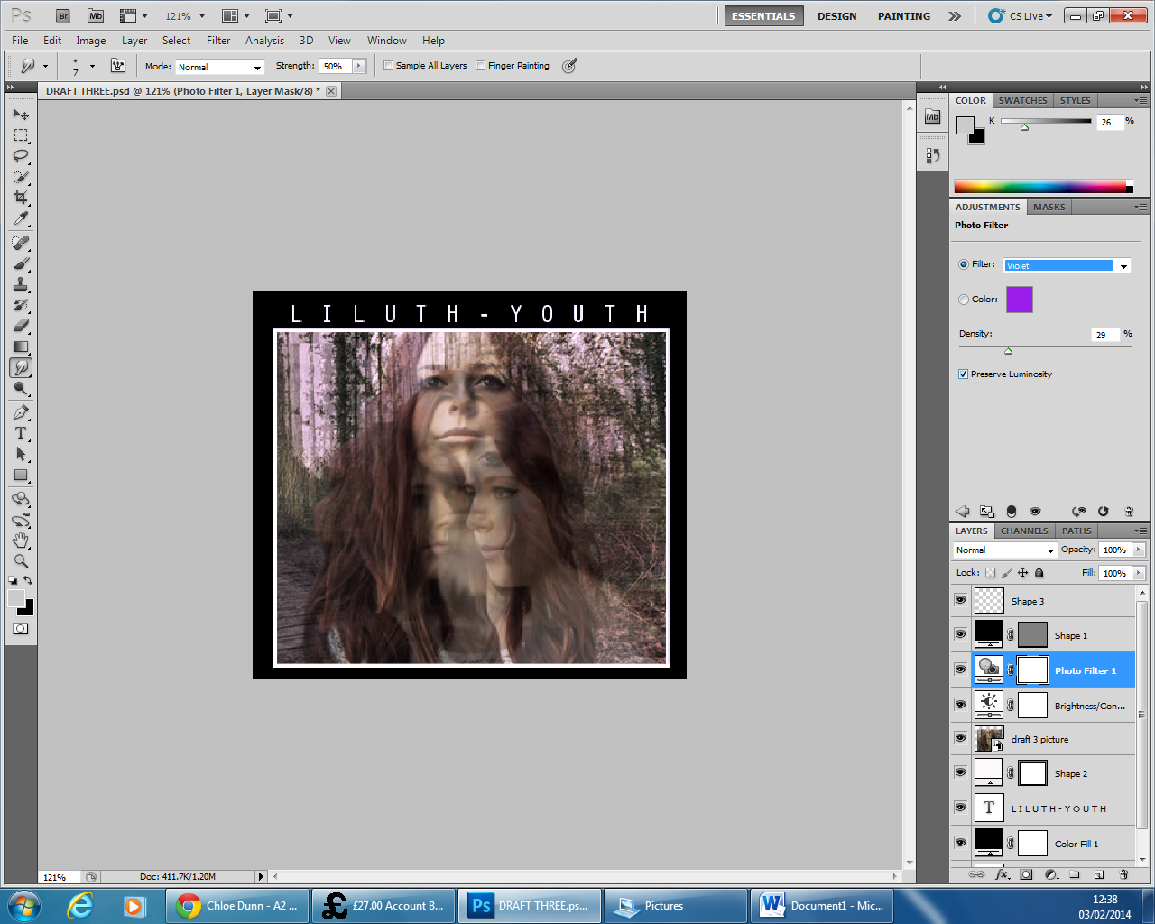
18 - I then added a violet photo filter to contrast nicely with the neutral greens and browns in the original image.
19 - After this, I continued to add another photo filter, this time an orange one warm up the image whilst still keeping a nice balance of neutral and brighter colours.
20 - I then further increased the contrast to 100% as I wanted to give the maximum amount of definition to the faces. It also made the colours stand out a lot more and I believe grab the viewers better.
21 - Lastly, I added another photo filter, this time a very light blue. I found this highlighted the white in Lily's face really well and seemed to make her project out of the cover more.


No comments:
Post a Comment